I walk through the door, and in that first breath, I know. Is this a space that holds me, or one that holds me at arm's length? A home whispers its intentions long before the host speaks. It’s in the sigh of the door closing, the light that falls upon the floor, the air that moves—or doesn’t—through the rooms. As I reflect on the spaces that have truly welcomed me, and those that left me subtly on edge, I realize the art of hospitality is woven into the very fabric of our design choices. What makes a house feel like a home for everyone who enters, not just for those who live there? The answer, I’ve found, isn’t in grand gestures, but in quiet, thoughtful details that speak the language of comfort.
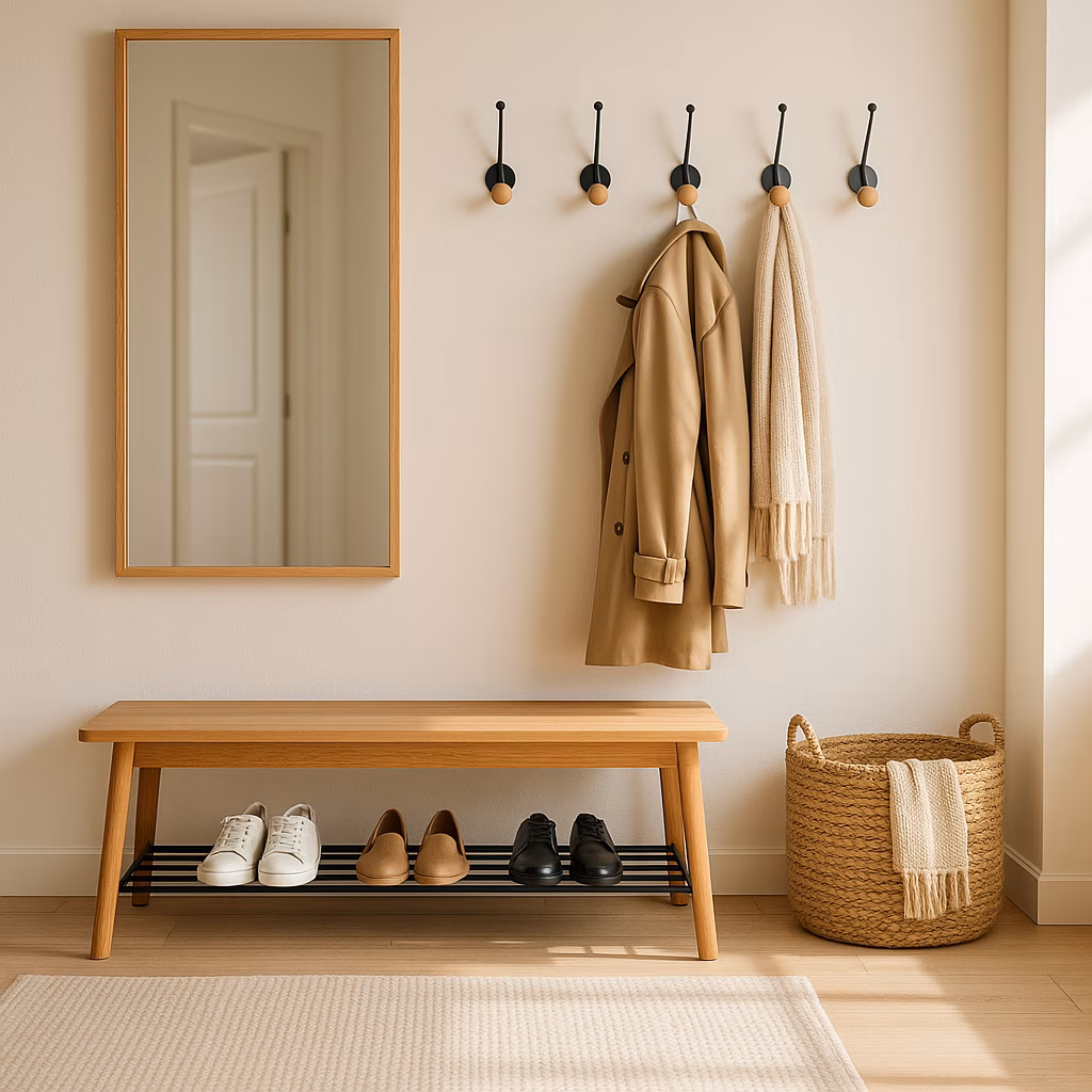
The First Breath: The Entryway's Silent Invitation
 :max_bytes(150000):strip_icc():format(webp)/GettyImages-1442113594-79b0406e65d745f7a8a1d288cb613ec4.jpg)
Have you ever felt the subtle panic of a cramped entry? A jumble of shoes, a coat rack groaning under its load, no place to put down your bag. It sends a message, doesn’t it? It whispers, “Hurry through, you’re in the way.” I believe the entryway is the handshake of the home. A thoughtful, uncluttered entry tells a story of anticipation. It says, “Come on in—we’ve been expecting you.” It’s not about size, but intention. A simple landing spot—a bench to sit on, a hook for a coat, a tray for keys—creates a moment of calm. This pause upon entering shifts the energy from chaotic arrival to peaceful welcome. When those first few steps feel designed rather than an afterthought, the entire home opens its arms.
The Palette of Comfort: Why Color Is a Feeling
Is a home painted in the colors of a cloudy sky, or the hues of a sunset? Color, I’ve learned, is not merely seen; it’s felt. Cool grays and stark whites have their place, but can they ever truly embrace? I always lean toward the warm tones, the colors you’d find cradled in nature: the soft terracotta of sun-baked clay, the gentle green of moss, the creamy white of sand. These are the colors that hold you. If neutrality is your sanctuary, the secret lies in the undertone. Choosing a white warmed with a hint of peach or gold makes all the difference. It wraps a room in soft light rather than reflecting a clinical glare. It’s the difference between a blank page and a page waiting for a story.
The Dance of Light and Shadow
What is light, if not the mood of a room? Harsh, overhead lighting is an interrogation. It leaves no room for secrets, no space for softening. It creates a sterile feel instantly—if a living room feels like an exam room, how can anyone possibly relax? I chase the gentle glow. The magic happens in layers:
-
Ambient Glow: Warm bulbs (2700K-3000K) in fixtures, never cold blue tones.
-
Task & Accent: Lamps that pool light in reading nooks, highlighting art or a beloved bookshelf.
-
Dimmer Switches: The ultimate tool for dialing the atmosphere from lively gathering to intimate conversation.
This dance of light and shadow invites people in, allowing them to find their own comfortable corner in the glow.
The Conversation Circle: Furniture That Connects
Look at your living room. Where does the energy flow? Is every seat a throne facing the television, a silent audience to a glowing screen? When every chair faces the screen, it doesn’t encourage connection; it demands attention. I try to arrange seating to face each other—it naturally shifts the energy toward conversation, toward shared laughter. And what of the furniture itself? Is it too precious? Is there an inherent tension in feeling like things can’t be touched or sat on? A home should not be a museum. I want my guests to sink into a sofa, to prop their feet up, to feel they can truly inhabit the space. Give them a place to kick back, literally and figuratively.
| Unwelcoming | Welcoming |
|---|---|
| Furniture arranged for TV viewing | Seats arranged to face each other 👥 |
| Stiff, formal seating | Deep, comfortable cushions & throws 🛋️ |
| "Look, don't touch" decor | Textures that invite interaction 🤲 |
The Flow of Space: Ease of Movement
Your home doesn’t need to be vast, but does it breathe? A dark, cramped layout with a confusing floorplan can make a guest feel like they’re navigating a maze. Closed-off rooms where gathering spaces aren’t visually connected can make hosts and guests feel separated, even in the same house. Sometimes this is structural, but often it’s in the placement. Poor circulation paths force awkward detours—sidestepping a coffee table, squeezing past a chair. It’s hard to feel at ease when you’re constantly negotiating your passage. The goal is flow. A clear path that allows movement to feel natural and effortless. It’s the architectural equivalent of a deep, easy breath.
The Beauty of the Lived-In: Imperfectly Perfect
Here lies perhaps the most tender truth. If a home looks like it’s straight out of a magazine, pristine and untouched, will your guests ever feel they can relax? Perfection can be a wall. When everything is fragile or meticulously arranged, a home loses its warmth. The homes I love most are lived-in and personal. They bear the gentle marks of life—a stack of well-loved books, a slightly rumpled blanket, a collection of shells from a favorite beach. This doesn’t mean messy or cluttered. It means real. It means layering in soft textures (think wool, linen, cotton) and natural materials (wood, stone, ceramic) that bring in a sense of ease. It’s the difference between a showroom and a sanctuary. It invites guests to get comfortable, to be themselves, to add their own energy to the space.
In 2026, as our world spins ever faster, the need for a true sanctuary—for ourselves and for those we welcome—has only deepened. A welcoming home is not about lavish entertainment or flawless decor. It is a series of quiet, heartfelt choices: a place to land, a warm hue on the wall, a soft light in the corner, a chair turned toward a friend. It is the creation of a space that doesn’t just house people, but holds them. It says, without a word, You are welcome here. Come, rest, and be.